Component configuration
Each component can be configured individually. This allows for adjusting its value, behavior (especially by linking a script to the component), and styling.
For more details on the configuration of each type of component, see the list of components.
Component with data source
Most of components settings can take a data source. The data source can be a static value, connected to an output or the result of a attached runnable.

Static data source / Template
Depending of the type of the data source, the input will be different. For example, if the type of the data source is string, the input will be a text input.
Connected data source
The data source can be connected to any outputs through evals
Learn more
Runnable data source
We can also use the result of a runnable as a data source.
Learn more
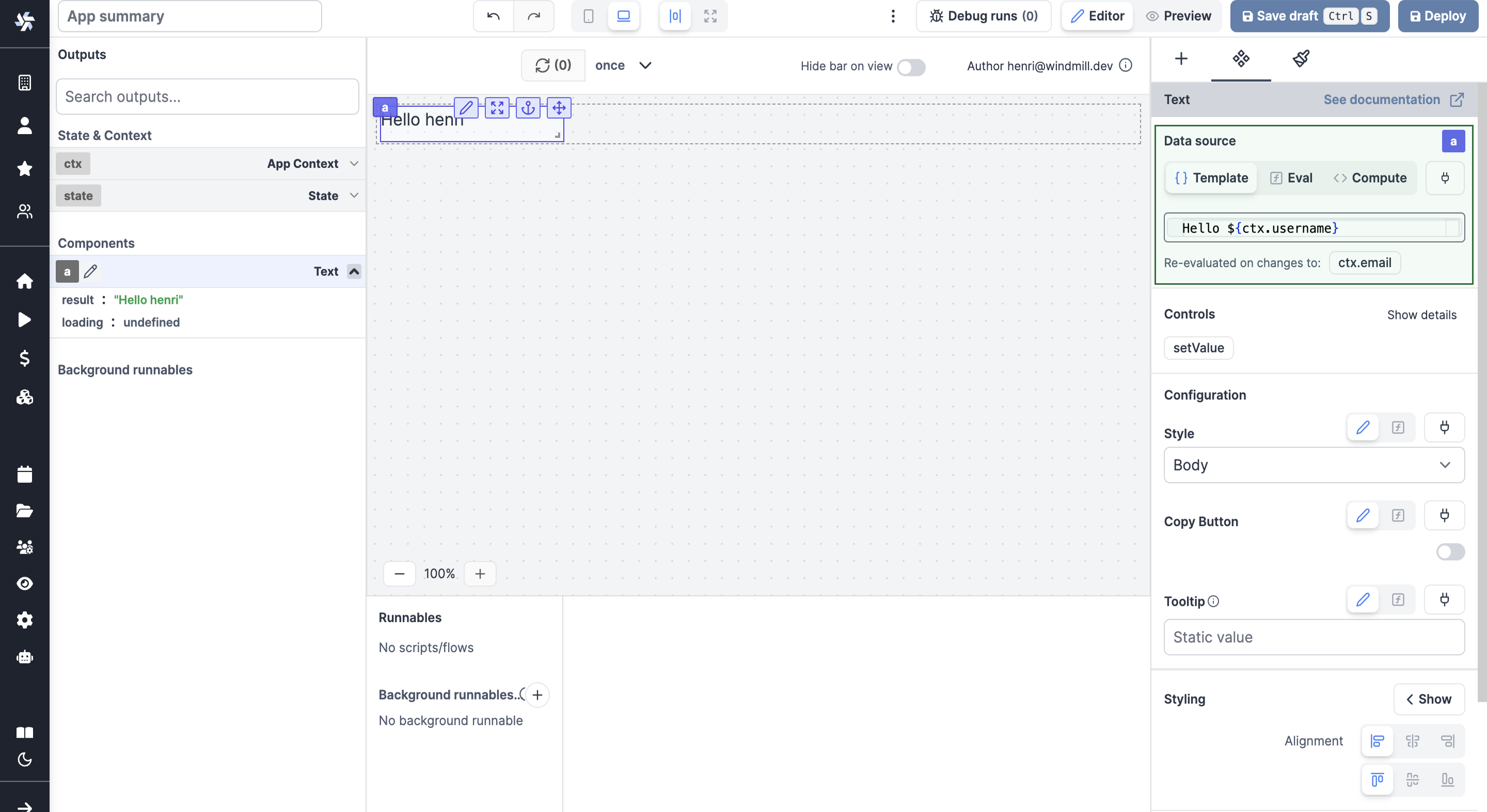
Template data source
We have a special type of input called template. A template is a special type of input where we can use variables. For example, if we have a variable username the context, we can use it in the template like this: Hello ${ctx.username}}.
The Text component has a template data source, and it replaces the static data source.
Runnable inputs
If a runnable is attached to a component, the component will have a new section called Runnable inputs. This section contains all the inputs of the runnable.
In the same way as the component inputs, the runnable inputs can be static, connected to an output or the result of an evaluated template.
The type of the inputs are automatically inferred from the scripts. For example, for this TS script:
export async function main(mode: 'editor' | 'preview', name: string) {
	return mode;
}
The type of the input will be select with the values editor and preview, and the type of the input name will be string.
Component configuration
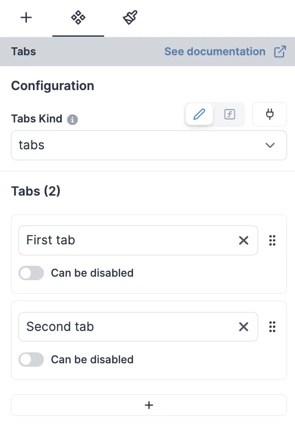
Each component has a configuration section. This section contains all the configuration of the component.

Learn more
Inputs
Windmill supports multiple types of inputs. Inputs are used to configure the components and runnables. We supports the following input types, as well as the corresponding array types:
- Text: a simple text input.
- Text area: a multi-line text input.
- Number: a number input.
- Boolean: a checkbox.
- Date: a date picker. The date format is
DD.MM.YYYY. - Template
- Object: a JSON editor.
- Select: a dropdown list.
- Color: a color picker. The color format is
#RRGGBB. - Icon select: a dropdown list with icons. The icons come from Lucide.
- Labeled resource: a dropdown list with resources.